TITLE
The title is going to be "International collection special" since the entire double sheet spread demonstrates different branded clothing. I have already mentioned this title in both my cover and contents page.
background

I'm just going to have a plain white background. I researched into many fashion magazine and the majority of them have a white background unless it's a teen or music magazine.
The font

This font actually looks very interesting but then again I realised that this is more for music magazine because of the bold writings and the connotations it provides. This font gives a brave look and defines strength which is essential for the reader to feel, however it does not have anything to do with fashion which is my main genre.

I really liked this font because it feels really feminine and it would suit my target audience, however it does not seem very formal. It has an elegant style towards it and the cursive writings may differentiate from other fonts, but I decided not to use this since I never really see other professional Bauer group magazines use this font.
Final selection

This is the same font I have used throughout the magazine and I've decided to use it for my double page spread as well because normally in a professional magazine, they repeat the same font for use of synergy and for the audience to get used to the brand's main factors. Like I previously said, this font provides a fashionable look plus boldness.
The main font I used is Bodoni which is being used throughout the magazine, not just the double sheet spread. I used the same font for uses of synergy and convergence.
colour scheme

Purple connotes sensitivity and it's compassionate and it means being supportive, understanding and being motivated. It determines a helpful nature where you don't take advantage of someone else. I want to spread positivity to everyone who read my magazine, therefore i feel that this colour is a good choice.
Positive ideologies: Royalty, value, sacredness, bravery, spiritual awareness, vision, luxury, truth
Negative ideologies: Introversion, decadence, suppression and inferiority
Positive ideologies: Royalty, value, sacredness, bravery, spiritual awareness, vision, luxury, truth
Negative ideologies: Introversion, decadence, suppression and inferiority

The colour white affects the mind and body by aiding in mental clarity, promoting feelings of fresh beginnings and renewal, assisting in cleansing, clearing obstacles and clutter, and encouraging the purification of thoughts and actions.
Positive ideologies: Hygiene, clarity, purity, cleanness, simplicity, sophistication, efficiency
Negative ideologies: Coldness, barriers, unfriendliness.
Positive ideologies: Hygiene, clarity, purity, cleanness, simplicity, sophistication, efficiency
Negative ideologies: Coldness, barriers, unfriendliness.

To the human eye, orange is a very hot color, so it gives the sensation of heat. Nevertheless, orange is not as aggressive as red. As a citrus color, orange is associated with healthy food and stimulates appetite. Orange is the color of fall and harvest. In heraldry, orange is symbolic of strength and endurance.
Positive ideologies: Physical comfort, warmth, security, sensuality, passion, abundance and fun
Negative ideologies: Deprivation, frustration and immaturity
Positive ideologies: Physical comfort, warmth, security, sensuality, passion, abundance and fun
Negative ideologies: Deprivation, frustration and immaturity
All image options :
These are 35 images that were taken in a fashion show that happened in Chennai, India. During the beginning of year 12, me and my friends planned to go to this fashion show which was in the Marriott hotel Chennai. That is when I took all these pictures and luckily I was sitting on the front row.


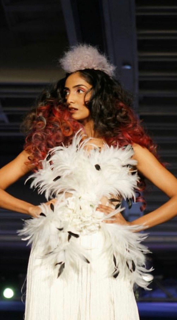


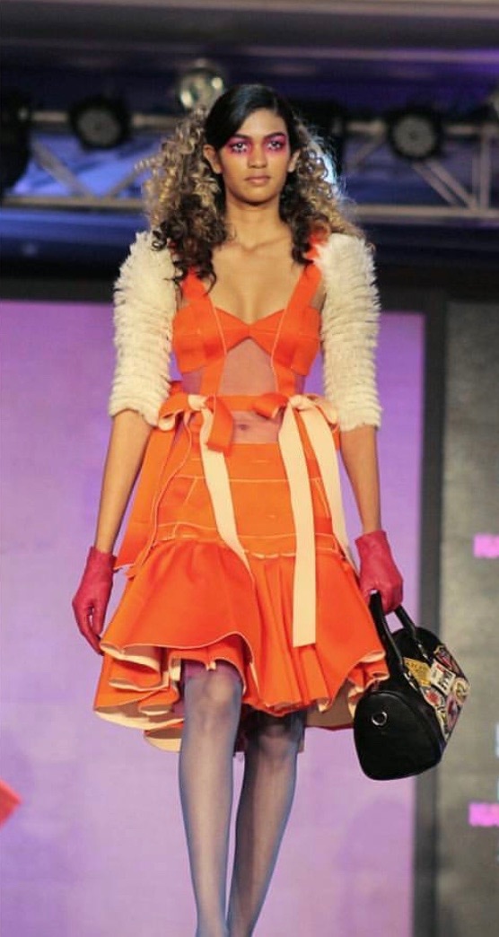


The pictures I decided to use for the double sheet spread :
|
From the The black and white fusion : |

|

|

|

|

|
|
From the Ethnic wear : |

|

|
|
From the Carnival costume : |

|

|
Out of these 10 images, i needed to crop 3 :

|

|

|
Later while doing the double page spread, I did not really need the images on the right and the left, I only used the central image. I had about 9 pictures in my double page spread already and I didn't want to overload it with tons of pictures, therefore I just choose one cropped image to at least show that I made use of photoshop.
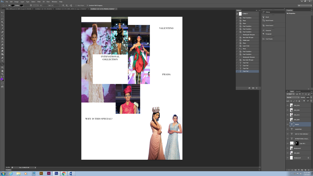
Inserting the images
This is my first stage in creating my double page spread and here I have inserted my images into photoshop in a layout that I have decided to apply.

|

|
Inserting the titles
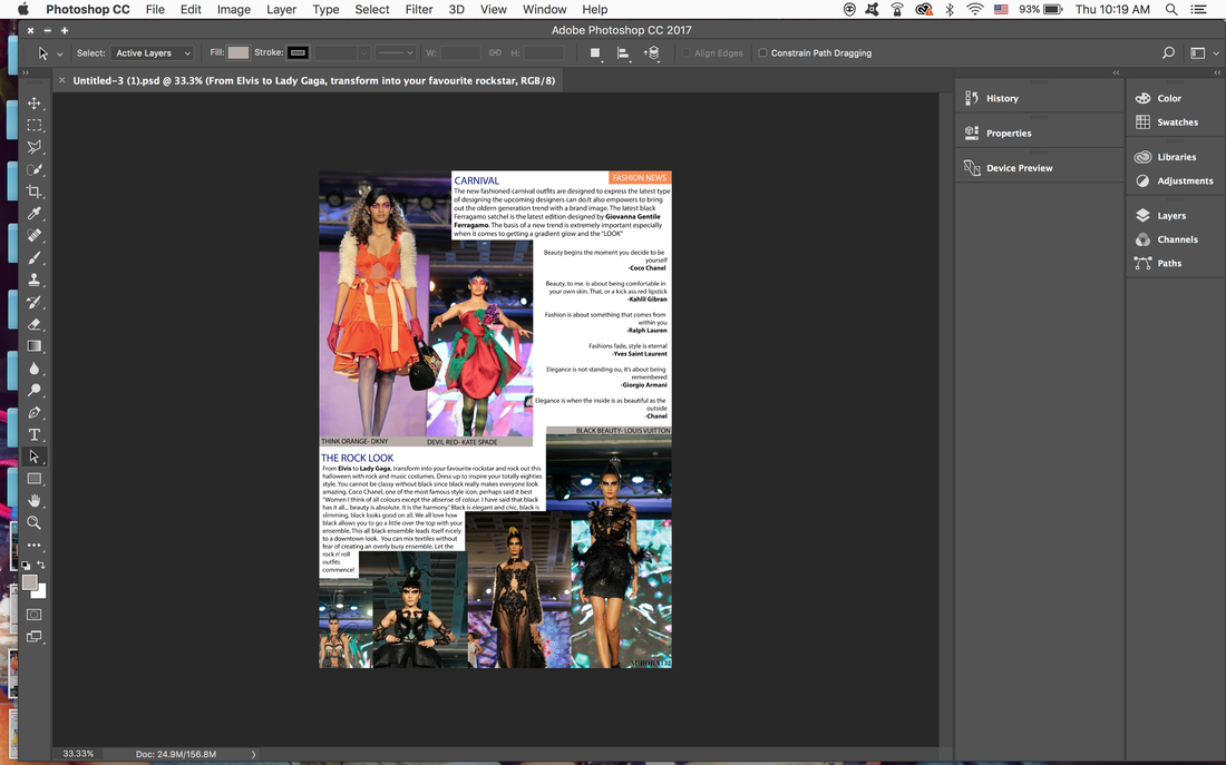
The main title is first added and that is "What's happening in Aurora?" as this is what I want my audience to read when the flip to this page since it has reference to the magazine name (a way of creating brand loyalty or promoting the brand name). I decided to first add the subheading for each of the picture. I wanted a name which would suit those particular pictures as a whole so I wrote ethnic wear and carnival, but apart from that, since this is a high end magazine, I wanted to show that these clothing are branded so I used the names Valentino and Prada since they are one of the biggest brands among the fashion industry, I also added the subheading "international collection" because I wanted to show the reader that this is an article about various kinds of fashion. Bottom of the second page, I wrote "Why is this special?" I wanted to write this to show audience that this is a special issue and this kind of celebration/fashion show has not happened in a long time.

|
|
Inserting the articles
In this stage, I started to write short articles under my subheading. I basically wrote what each of the pictures are and explained the concept behind it and gave an intro to the fashion designer who created it. Then on the second page I gave a brief introduction to the brands to show how successful they are and to express that these brands are demonstrated in my magazine to create a sensational name. Just below the main title, I also added a few quotes said by prestigious fashion designers as I thought people interested in fashion will like to read those.
|

|
changing a few images
At the bottom left hand corner, I had about 4 different images preciously but I realised it does not look so great as it feels there are too many images combined together so I decided to add this image of a model with white clothing. First, I cropped that image then duplicated it 3 times and placed them next to each other in different sizes. Even though the clothing and the background seems to both be white, I feel that it still stands out and is eye catching and is much better than placing 4 different images in that section.

Changing the heading and subheadings colour
I haven't done much in this stage, the only thing I did was change the colour of the title and the subheading in purple according to the colour scheme which I discussed earlier. I think this colour really suits the page since the background of the images is mainly purple and that's why I used the eye dropper tool to observe the same colour.

|

|
final changes
So these are my final changes. First, I realised there is no synergy between my other pages and this page so I created this small orange rectangular box on the top corners of my double page spread to just show the synergy in colour scheme. I deleted the quotes said by fashion designers and instead added an introduction to the page. I changed the heading to "The international collection" since that is what the entire double page spread is about. I also wrote more information below my subheadings to cover unwanted space. In the articles, I made the names in bold since I want the key details to be seen clearly. Below the images, I added a small caption in a grey rectangular tab to show what the picture is about. Also, as you can see, my second page in the double page spread has changed as I wanted a different layout than before. I have deleted certain images and added a few, the writings/article has also changed to be related to the first page of the double page spread.

|
|
