
|

|

|
Name of my magazine
Possible names for my magazine :
1. Aurora.
This is actually my friend's name which suddenly came into my mind while thinking of a name for my magazine. I think it's a very fancy and elegant name which suits the Fashion genre. Also another famous reference to this name is the popular classic "Sleeping Beauty".
2. Fashionology.
This is just a really close reference to fashion to make it seem obvious that my magazine is purely about fashion, but later I realised that this is not a powerful name and it seems more like a teen magazine name, whereas my magazine aims at a well settles, mature audience.
3. The official.
This is actually a very serious name and I thought that even though I have a mature target audience, my name should relate at least a little bit to my genre.
Final choice:
I choose to use the name Aurora.
Latin Meaning: The name Aurora is a Latin baby name. In Latin the meaning of the name Aurora is: Aurora was the mythical Roman goddess of the dawn. This name became very popular after Charles Perrault wrote the fairy tale 'The Sleeping Beauty'. Since mine is a fashion magazine, I would want it to refer to beauty. Also because the majority people I asked said they prefer the name Aurora from my questionnaire. Aurora is a name which has not been used in other magazines
Possible names for my magazine :
- Aurora
- Fashionology
- The official
1. Aurora.
This is actually my friend's name which suddenly came into my mind while thinking of a name for my magazine. I think it's a very fancy and elegant name which suits the Fashion genre. Also another famous reference to this name is the popular classic "Sleeping Beauty".
2. Fashionology.
This is just a really close reference to fashion to make it seem obvious that my magazine is purely about fashion, but later I realised that this is not a powerful name and it seems more like a teen magazine name, whereas my magazine aims at a well settles, mature audience.
3. The official.
This is actually a very serious name and I thought that even though I have a mature target audience, my name should relate at least a little bit to my genre.
Final choice:
I choose to use the name Aurora.
Latin Meaning: The name Aurora is a Latin baby name. In Latin the meaning of the name Aurora is: Aurora was the mythical Roman goddess of the dawn. This name became very popular after Charles Perrault wrote the fairy tale 'The Sleeping Beauty'. Since mine is a fashion magazine, I would want it to refer to beauty. Also because the majority people I asked said they prefer the name Aurora from my questionnaire. Aurora is a name which has not been used in other magazines

|

|

|
Clothing used in my front cover :
Before I choose : All my 5 images had different costumes. One was a simple, daily wear outfit, one was a floral wear, another was a swimsuit and finally one was a white crop top with a mini skirt.
After I choose : It is a strapless flowered dress which really brings out the sense of modern and high tech fashion, it is full filled with a matching hair band with her hair held loose. The make up is light to show elegance and brightness with just a smokey eye and a rose pink lipstick.

|

|

|
Font :
I have tried a number of fonts to first test which goes best with the title name. I think that fonts used are really important while expressing how professional a magazine is... In terms of fashion magazines, after researching into Vogue, Harper's bazaar and Marie Claire, I could clearly see that the main fonts they use especially in the cover pic are very simple, natural and gives an exotic feel and that is what I aim to connotate through my magazine.
I have tried a number of fonts to first test which goes best with the title name. I think that fonts used are really important while expressing how professional a magazine is... In terms of fashion magazines, after researching into Vogue, Harper's bazaar and Marie Claire, I could clearly see that the main fonts they use especially in the cover pic are very simple, natural and gives an exotic feel and that is what I aim to connotate through my magazine.

I choose to use cooper std as my font since its big and bold but later on while doing the actual cover page, I decided to change the masthead to Bodoni 71 book as it is simple and elegant yet fashionable at the same time. Choosing fonts is the most hardest thing because there are so many options. I realised that I should not be using a bubbly and informal font in my magazine since my target audience are mid adults. Also, after a lot of research, I found out that professional magazines only have a maximum of 3 fonts so for the rest of the cover page, I used a total of 3 fonts : Bodoni MT, Georgia and Myriad pro.

This font seems to be very bold and it can be used to exaggerate things. This surely determines power, sincerity and it's about being brave which is something I want my readers to feel.

This font will suit the tone of my magazine which is formal yet fashionable. It has a feminine look to it which is filled with elegance and beauty.
Final selection

This font is definitely formal and since I'm doing a fashion magazine aimed towards adults, I think that this font will be attractive, also this is the same font which is used by VOGUE. This is a perfect font to use if I'm taking Vogue as an example. So in the end I finally decided to use this.

|

|

|
IMAGES

|

|

|
Mostly all magazines especially fashion magazine use close up or mid shots of the models in the cover page and this is to directly connect with the audience with facial expressions and clear details. For my image options, all of them are medium shots since I want the audience to look directly at the model in the face for a sense of identity and companionship, also because I want the model's clothing to be visible as well. The most important part is that the model in the front cover is always a famous celebrity so when readers see it, they immediately want to purchase the issue to read more about their favourite celebrity or role model. Either models are in a straight position or they are slightly turned, but in every position they must keep looking at the audience directly.
Choosing the perfect photo for my magazine :
iMAGE 1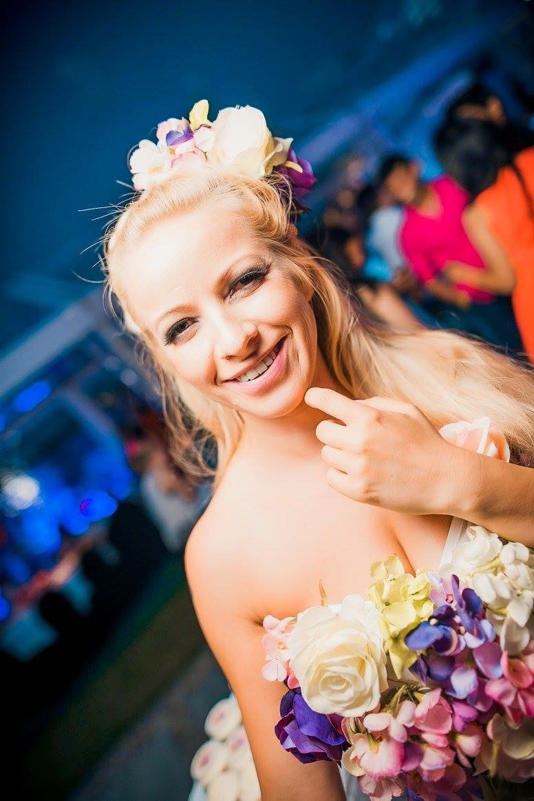
|
iMAGE 2
|
iMAGE 3
|
IMAGE 4
|
IMAGE 5
|
These are the photos that I originally took in a birthday party. In Poland, Warsaw, it was my best friend's birthday and over there, I was taking a lot of pictures of myself and my friends and these are just a few of it. I used a Sony video cam to take these pictures. It is actually a device which is specialised for taking videos, however an option for taking pictures is also available and surprisingly these pictures were really of good clarity. I also have a lot of other pictures but I choose these as my final option since these are all individual pictures of different people, different type of clothing and different attitude in each of the image and also because the brightness of the image is just too perfect to put in the front cover.
Image 1: This is a picture of my friend Rihanna. I think that this is a very good quality picture especially for a fashion magazine because of her clothing, her makeup and her position. She is also looking directly at the reader which engages them even more. Her smile is also an attraction and it can be used as a close up shot for the magazine cover.
Image 2: This is my friend Leah. I think her personality seems to be a very fun loving and her position seems to be very straight and directly looking at the reader (eye to eye). It's a medium shot picture and it can be used in the cover page, even though she is just wearing a simple outfit (swimsuit).
Image 3: The model's name is Ketsia, even though her dress and make up seems to be fashionable, this image doesnt suit the fashion genre. I think it's more of music or lifestyle or gaming genre. Therefore I decided not to use this picture for my cover.
Image 4: I used the same model again (Ketsia) because I really liked her outfit and her entire look so I wanted to give it another try. This personality seems bold and fun at the same time. The dark makeup especially the lipstick seems to be mature and elegant. Her position also seems to be fashionable and mature.
Image 5: This is the final image and the model is Anna. Her personality in this picture seems to be more like a sensitive and shy girl. Her clothing seems to be very simple and I think this would not suit a fashion magazine. Plus she is wearing glasses which you cant really see in a well known fashion magazine like Vogue.
Final selection

Finally I choose to use this picture since the dress she is wearing, her make up and the background all suits my genre (Fashion), also because this picture has an amazing clarity and her eyes are directly engaging the audience. Her costume is a floral wear which seems to be very colourful, different and eye catching. Her make up is light but suits her perfectly and compliments her outfit. Her hair style is simple but her hair accessory matches her outfit again. due to all these reasons, I decided to use this picture for my cover page.

|

|

|
Colour for the masthead :
Similar to the font, I wanted to see which colour suits the title depending on the background.

After comparing the colour of these title to the background of my main image, I decided to use pink since its a very feminine colour and my target audience are female but then I changed it to white later on as its the colour which would stand out from a dark background. Black and white are very much contrasting. It also stands out and is eye catching to the audience.

|

|
Planning the layout
This is just a preview layout done in Microsoft Powerpoint.

|

|

|
|
colour scheme

White is a colour which connotes protection and encouragement, offering a sense of peace and calm, comfort and hope, helping alleviate emotional upsets. It creates a sense of order and efficiency, a great help if you need to declutter your life.
Positive ideologies: Purity, reliability, support
Negative ideologies: Sterility, lack of humour, heaviness
Positive ideologies: Purity, reliability, support
Negative ideologies: Sterility, lack of humour, heaviness

Pink, a delicate color that means sweet, nice, playful, cute, romantic, charming, feminine, and tenderness, is associated with bubble gum, flowers, babies, little girls, cotton candy, and sweetness. The color pink is the color of universal love of oneself and of others. It also represents the feminine principal and it's used since my magazine's target audience are women.
Positive ideologies: Nurture, warmth, femininity, love, sexuality,
Negative ideologies: Inhibition, emotional, physical weakness
Positive ideologies: Nurture, warmth, femininity, love, sexuality,
Negative ideologies: Inhibition, emotional, physical weakness

Blue is the colour of the sky and sea. It is often associated with depth and stability. It symbolizes trust, loyalty, wisdom, confidence, intelligence, faith, truth, and heaven. Blue is considered beneficial to the mind and body.
Positive ideologies: Intelligence, communication, trust, coolness and reflection
Negative ideologies: Coldness, lack of emotion and unfriendliness
Positive ideologies: Intelligence, communication, trust, coolness and reflection
Negative ideologies: Coldness, lack of emotion and unfriendliness

|

|

|
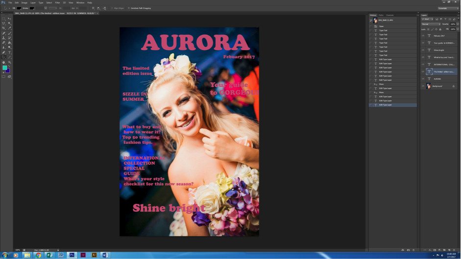
Then finally I started doing the actual cover page:
Inserting the cover image...

Inserting the masthead...
As told before, I applied the font Copper Std and filled it in pink.

Inserting the cover lines
Here I also added the Month and year of this issue under the masthead and I added the cover lines with the same font and colour of the masthead.
Changing the colour.
In this stage, I choose to fill my cover lines with light blue and white as its very much bright than before. The pink colour did not go too well with the background like shown in the previous image so I decided to change it.

Rotating the image...
Here I rotated the main image slightly since it looked too slanting previously. I also wanted the masthead to cover a part of the model's head.

Font changes...
Here I changed the masthead so that it looks like a 3D figure but it turned out to be really bold and big. I also changed the font of the cover lines to make it seem

Further font changes...
Then I realised that the 3D font was a bit too much and the pink colour was standing out too much so I changed the font to Bodoni 72 Book and the colour to purple and I used eye dropper tool to copy the purple colour from the model's dress to fill in the title.
Cropping the image
I wanted to zoom in the model a bit more and I wanted to tilt the image and I wanted the title to be partially hidden behind the model's head. Therefore I created a new layer to place it on top of my old layer to cover the title.

Final changes |

|
I am almost done with the my cover but I did do some final changes. I changed the masthead's colour to white as it's more clearly visible than the other colours and as you can see, my image has been zoomed in.

After contents page
After I did the contents page, I realised that my cover and my contents page were not identical and did not show any signs of synergy and convergence therefore I did a few changes to my cover such as changing the coverlines colour to orange (to match with my contents page) and by changing the font. My numbers are also much bigger.

few cover lines changes...
In this stage, I just made a few changes to the coverlines on the right side since it was not clearly visible so I changed the colour.I also added a barcode on the bottom left hand corner of the page.

new cover image
After I finished doing my contents page and my double page spread, I felt that my cover page is different and doesn't connect with issues of synergy so I went back to see my other cover photo options and wanted to give this picture a try:

New clothing used.
I found out that it is not necessary for the model to be wearing a very fancy outfit. The facial expression and the clarity is what matters.
Example:
Example:

New colour scheme

White is associated with light, goodness, innocence, purity, and virginity. It is considered to be the colour of perfection.White means safety, purity, and cleanliness. As opposed to black, white usually has a positive connotation.
Positive ideologies: Warmth, pleasant and peace.
Negative ideologies: Loneliness and depression.
Positive ideologies: Warmth, pleasant and peace.
Negative ideologies: Loneliness and depression.

Orange combines the energy of red and the happiness of yellow. It is associated with joy, sunshine, and the tropics. Orange represents enthusiasm, fascination, happiness, creativity, determination, attraction, success, encouragement, and stimulation.
Positive ideologies: Happy, seasonal and enthusiastic.
Negative ideologies: Relation to red which connotes danger and negativity.
Positive ideologies: Happy, seasonal and enthusiastic.
Negative ideologies: Relation to red which connotes danger and negativity.
New background

I'm not going to be editing the main image from it's original background since the background is already light in colour. When I researched into fashion magazines, majority of them have a white background and I think this is done to give more attention to the main image. Even though mine is not completely white, it has some reference to a light colour.
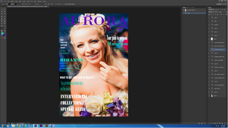
replacing new cover image in photoshop
After I inserted the new cover photo to my previous work, I realised that this looks much better and the colour scheme suits this picture better than the other one therefore I continued to proceed with this.

overlapping cover image and masthead
Over here, I first duplicated my cover image, rasterized the layer, used the polygonal lasso tool to crop over the model's head, then I placed the image in front of the masthead.

Changing fonts
Over here I changed the font of the right hand side coverlines and also added a few new cover lines.

Final changes
So a few coverlines were moved in this stage to make it more visible. Then I even added a price on top of the bar code in a very small size. The price is $4.99 since mine is a similar fashion magazine to Vogue, I wanted it to have a high price to maintain a high reputation towards the target audience.


|

|

|
